Wildstyle: How Graffiti Letters Became an Art Form
To an outsider, a wildstyle piece can look like decoration rather than writing. To a writer, every arrow, wedge, and overlapping letterform is doing a job: making the name harder to copy, harder to write over, and unmistakably the work of one particular hand. Wildstyle is not letters plus flourish. It is a set of techniques for making a name into a puzzle that only other writers can fully read.
Starting from the tag
Every style in graffiti traces back to the tag, the fast signature written in one continuous motion. A tag already carries a writer’s personal rhythm: where the pen speeds up, where a letter gets a flick or a tail. Piece work is, in large part, an attempt to blow that personal rhythm up to a much larger scale without losing what made the original tag recognizable.
The throw-up as a stepping stone
Between the tag and the full piece sits the throw-up: a two-color, bubble-lettered version of a name designed to be completed in under a minute. Throw-ups exist because speed matters when a wall or a yard is risky, but they also became a training ground. Writers used throw-ups to test letter proportions and connections before committing to a slower, more exposed full piece.
Building an interlock
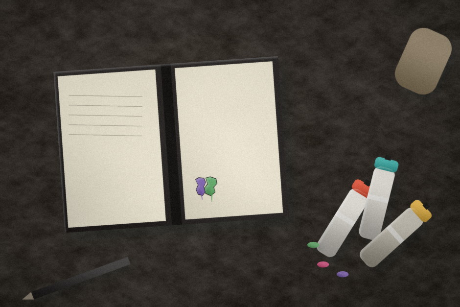
A wildstyle piece is constructed, not improvised. Writers typically sketch the name in a blackbook first, working out how each letter’s arrows, extensions, and connection points will interlock with its neighbors so the whole word reads as one continuous shape rather than a row of separate letters. Getting the interlock wrong is the most common way a piece fails, even when the individual letters are well drawn.
Color as structure, not decoration
Fill color, outline color, and a highlight or drop shadow work together to keep an interlocked, exaggerated letterform legible. A strong three-dimensional highlight along one edge does more to separate overlapping letters than any amount of extra outline, which is why experienced writers spend as much time planning light direction as they spend planning the letters themselves.
Readable to writers, abstract to everyone else
The deliberate difficulty of wildstyle was partly the point. A name that only other writers could decode was proof of fluency in the form, and pieces that were too easy to read were sometimes seen as unambitious. That gap between what a writer sees and what a passerby sees is still the main reason wildstyle reads as pure abstraction to people outside the culture.
A technique that outlived its origin
Wildstyle spread far beyond New York, adapted into local alphabets and regional conventions, but the underlying method never changed: sketch, interlock, structure with color and light, then execute at full scale under whatever time and space is actually available. It remains the clearest evidence that graffiti’s most abstract-looking work is, underneath, extremely deliberate craft.